client

& For Love

Service

Branding

About the project

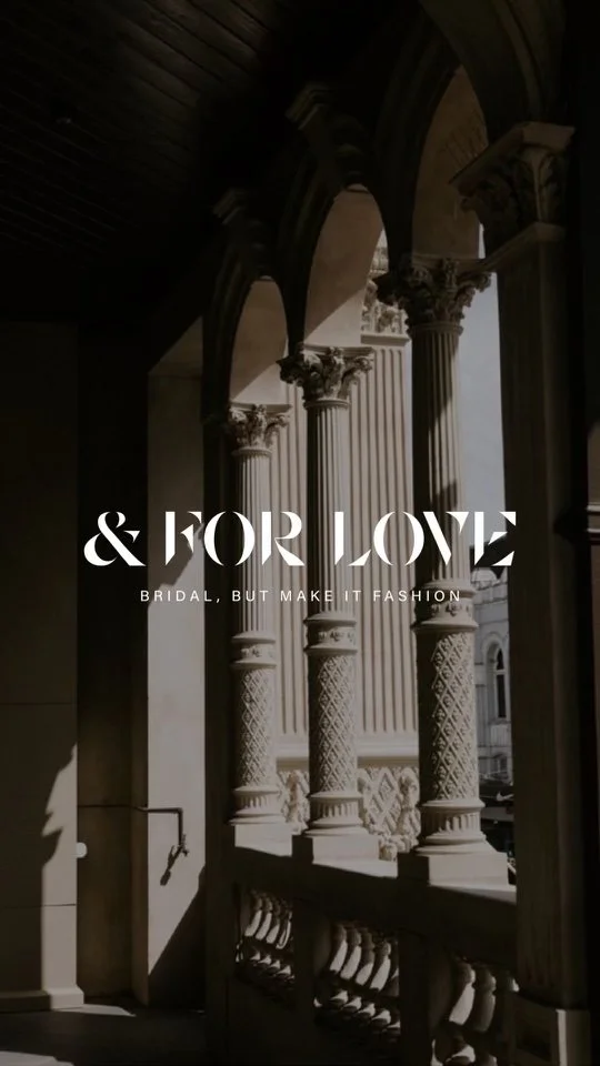
Our primary objective during the rebranding of '& For Love' was to distinguish ourselves significantly from other brands in the market. Drawing inspiration from 'Byredo' to infuse a fresh essence while preserving the brand's core identity. The logo featured sharp edges and shapes, cleverly forming words, lending a chic and understated vibe to the brand. This was complemented by a carefully curated typography hierarchy and a neutral colour palette, enhancing the overall edgy and cool aesthetic.

Text on black background reads 'LOVE & FOR LOVE' in white, stylized font.
Close-up of beige textured wall with white ampersand symbol.
Close-up of a white sign with black 3D letters reading '&hork Jove', attached to a building.
Photo of classical architectural columns on a building's balcony with sunlight casting shadows, overlaid with text that reads '& FOR LOVE' and 'BRIDAL, BUT MAKE IT FASHION'.
A gift box wrapped in white paper with black letters spelling 'VIOR' and a white ribbon bow on top, placed on a black surface.
Smartphone displaying an Instagram profile page on a white surface with shadows and leaves in the background.